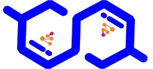

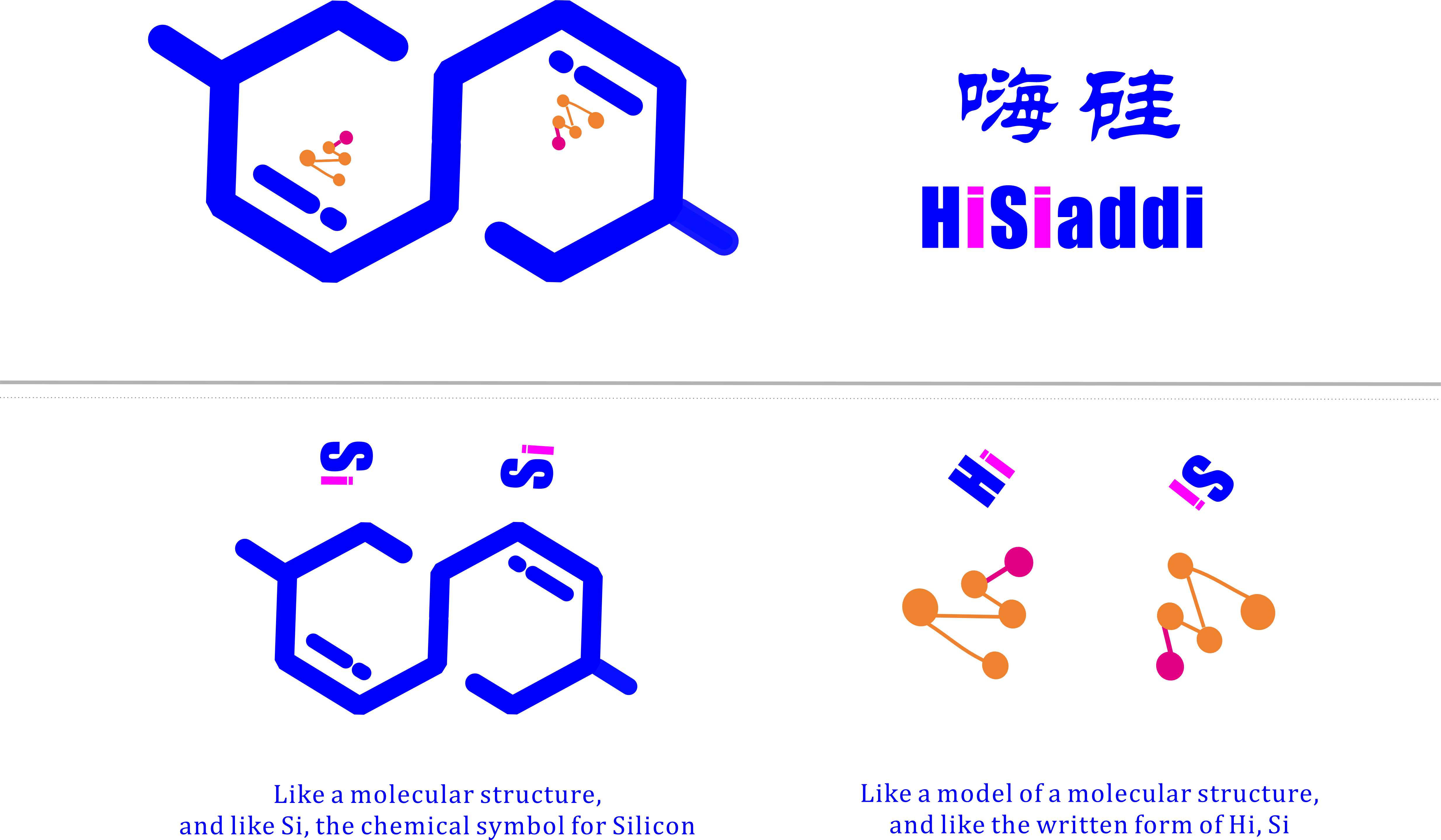
Its overall shape resembles a molecular structure and the chemical symbol Si for Silicon. The orange triangular section inside evokes a molecular structure model and mimics the written forms of HI and Si.
The entire design adopts common geometric shapes: hexagons, short lines and perfect circles. It is easy for most people to recognize and can be readily fabricated from wood or plastic for physical logo signage. As it is built on streamlined, standard vector graphics, it resists distortion when exported for printing via most design software, supporting high-quality printing on all types of paper substrates.
This design also reflects the founder’s expectations and persistent commitment to the company’s core philosophy. The two open blue hexagons carry layered meanings: blue stands for the ocean, the unclosed outlines represent unmet market demands, and the two hexagons symbolize two parties in cooperation. Together, they illustrate collaborative partners separated by vast oceans, and embody our "1+1>2" business model that integrates technology commercialization with foreign trade export development.
The orange triangle represents our core product portfolio: chemical additives, food additives, daily-use chemicals and advanced new materials exported by our company. The blue lowercase i beneath the triangle takes the shape of ocean-going cargo vessels. Combined, they visualize our core business: delivering chemical raw materials to global clients via transoceanic shipping.
The logo’s overall visual language draws on chemical structural formulas, highlighting our dual identity as a foreign trade enterprise rooted in chemical research capabilities. We focus on the integrated development of technology transfer and foreign trade exports. We operate under the "1+1>2" business model.
Our core belief: 1+1>2
Paired together, the orange triangle and blue regular hexagons symbolize our sincere collaborative mindset and passionate service spirit. We cross towering green mountains and boundless blue oceans to build long-term partnerships and genuine emotional bonds with every client.
Our enduring creed: Mountains and oceans cannot stop our sincerity.
There are still details of this logo that leave room for improvement in my opinion. For instance, I originally planned to render the borders of the two hexagons with ocean-blue hydrological textures to instantly evoke imagery of the sea at first glance. I also intended to give the orange triangle a 3D perspective effect to strengthen its visual association with physical molecular structure models.
However, I had no prior experience with any graphic design software, and this marked my first-ever logo design. I created it solely out of the need for a brand identifier for my newly founded company. Initially, I commissioned professional designers from the market, yet none of their drafts matched my vision. I then researched mainstream logo design software online and settled on CorelDRAW. After roughly two to three days of basic self-learning, I designed this corporate logo while teaching myself the software on the fly. Constrained by my limited graphic design proficiency, I could only deliver the current version as the final feasible outcome.
Lastly, I would like to share that before arriving at this finished logo, I drafted countless joyful conceptual designs only to discard them one after another. The creation process was full of twists and turns, accompanied by many interesting anecdotes. Due to length constraints, I look forward to sharing these stories with everyone at a later opportunity.
Much like every encounter and partnership we forge with friends and clients, our journey together inevitably involves trials and setbacks. Yet through consistent communication and collaboration, we earn mutual trust, tangible achievements, new hopes and steady progress. This aligns perfectly with our corporate philosophy: Mountains and oceans cannot stop our sincerity.

 +86-13120989737
  info@hisiaddi.com
 English